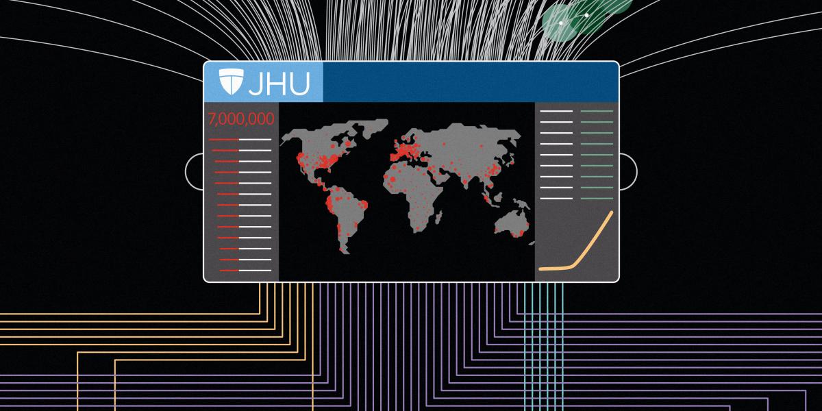
A Coronavirus Clearinghouse for the World
As the world fights SARS-CoV-2, the numbers funnel through one critical Johns Hopkins map.
One January day, Ensheng Dong was again watching the COVID-19 numbers in his home country of China.
His PhD adviser, Lauren Gardner, suggested they create a dashboard. The team had previously built something similar to assess U.S. measles risks. Ensheng, a first-year PhD student at the Center for Systems Science and Engineering at Johns Hopkins University, had a working coronavirus map by the end of the day.
Four months later, Ensheng has seen the dashboard behind world leaders and across news sites. Many other virus trackers rely on it as a source, and the team maintaining it has grown to 25 people. “I had to drop a class,” he said of the project’s impact on his graduate career. “But it’s worth it.”
-
January 22
The map dashboard launches, compiled singlehandedly by graduate student Ensheng Dong.
-
February 1
The team expands the dashboard's default view from China to the globe.
-
February 26
Traffic surpasses a billion pings a day. Servers crash. Esri, a private mapping company, helps host.
-
March 22
The dashboard begins tracking U.S. COVID-19 cases at the county level.
-
April 9
The JHU team adds a U.S.-focused tab to the dashboard.
-
May 15
Map gets detailed regional numbers for Italy, Germany, Spain, and other countries.
